By Kartik Aiyar, Head of Creative, Team Red Dot

“I presented a great idea, but the client didn’t buy it.”
“The original idea was great, but the client insisted on more branding.”
“We wanted to create a great ad, but the client wanted to tick boxes.”
If you’re an agency creative, you are most likely to have said this to a colleague or a friend. With every creative having at least 500 ideas in the drawer (if not more), we often blame the client for their fate. Though our idea can be rejected for a lot of reasons beyond our control, I’ve always felt that we can at least minimize this possibility with due diligence at our end.
Over the course, I have tried to weave the idea around what a client would gladly approve. I’ve loved the challenge of ensuring that the work is still creative and client-friendly at the same time.
Here are a few examples, ranging across five mediums, that have become my true north. I use them to judge my ideas and pre-empt their fate even before they get to the client. The intent is to reduce the possibility of returning with a ‘No’ and ensure that the hours spent into thinking and executing every idea is worthwhile.
So, my theme for this column:
Work that hits the sweet spot of being client-friendly and creatively satisfying
Five ads I wish I’d made…
1/
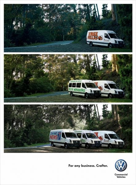
The classic client fetish: “The branding and the product have to be prominent and unmissable. In fact, make my product the hero.”
Solution: Show the product, not once, not twice, but thrice! In the same ad! And yet, produce something that’ll make the world jealous.
Idea: There’s a Volkswagen for every business.

Client: Volkswagen
Agency: Ogilvy, Cape Town
Medium: Print & Poster
Volkswagen, one of my favourite brands with a great history of remarkable advertising, found a way to put the product at the centre of the ad thrice while conveying a great story. Can’t think of any reason why a client would say no to this idea.
2/
Every marketeer’s safest bet: The efficacy demo
Solution: We will give you the best demo ever!
Idea: Translator
Client: Volkswagen
Agency: Almap BBDO, Sao Paolo
Medium: Film
A demo film from sec 0 to sec 30, with the killer punch at the end suddenly lifting the creative from being ‘just another demo’ to being ‘a new benchmark’ in demo ads. Pure genius!
3/
Favourite tick box: Show product usage
Solution: Let’s make something as banal as a card swipe look so sexy that you’d want to keep watching it over and over again.
Idea: The Social Swipe
Client: Misereor
Agency: Kolle Rebbe, Germany
Medium: Outdoor Activation
Having worked on a payment technology brand for a while, it was gut-wrenching to see this idea. Though it was created for a charity, I love the way they made a card swipe look so interesting by physically showing the impact of each swipe. Engaging, visually appealing and impactful.
4/
The elephant in the room: Is the idea scalable?
Solution: A wearable (how small can it get?), without the tech.
Idea: Immunity Charm
Client: Ministry of Public Health, Govt. of Afghanistan
Agency: McCann Health, India
Medium: Product Innovation
The UAE being an activation-oriented market, how many times have we tried selling an idea with a booth or a dispensing machine, only to be turned down citing ‘scalability’ to be the problem? That’s why this brilliant idea, rooted in culture and extremely efficient to be replicated across an entire country makes it a dream solution.
5/
The dreaded question: Will this idea cost an arm and a leg?
Solution: Devise a clever promo with just an announcement film and divert the money towards the customer incentive.
Idea: Space for rent
Client: IKEA
Agency: 303 Lowe, Perth
Medium: Brand Activation
I love how IKEA actually paid customers for having the catalogue in their houses through this clever promotion. Translating the space occupied by the catalogue as a precious piece of real estate was brilliant.
… and one that I did.
Idea: Conversations
Client: Al Serkal Avenue & Al Manzil School
Agency: DDB Dubai
The client brief was just a brochure for the silent auction. We took the initiative to scale it further into a much bigger activation with a story. It started with creating a logo unit that inspired an engagement idea, followed by scaling it across a spectrum of touch points. And yes, the cost was zilch.


